Virtual try on app

Virtual try on app

FitMeRight – A Case Study on Virtual Clothing Try-On Experience Where Screens Become Dressing Rooms!

FitMeRight – A Case Study on Virtual Clothing Try-On Experience Where Screens Become Dressing Rooms!

This case study is part of my UX assignment, where I navigated the entire design process—from research and prototyping to testing and iteration with guidance from my mentor, Anudeep Ayyagari, and support from my peers.

Goal was to Help online shoppers visualise fit + style through Virtual try on, reducing guesswork and boosting confidence.


If the project was real this solution could positively impact business metrics by increasing conversion rates and reducing return rates by up to 20%.

Timeline: Jan 2025 - Feb 2025 (4 week)

Timeline: Jan 2025 - Feb 2025 (4 week)

Plateform: IOS App

Plateform: IOS App

My Role: Product Designer

My Role: Product Designer

Problem

Problem

Shopping Should Be Fun -Until it’s not! 😟

But...why I am saying that?!

Well! Imagine a scenario where you have ordered a dress for a party. You are very excited about it and eagerly waiting for it to arrive.


…But at the same time, you are worried about how it will look on you, how the size will fit, will it arrive on time or not, and experiencing these mixed feelings! And this stage is extremely critical as the result will decide your experience…

Now imagine you got the wrong size 😫, and you are also not liking how it looks on you! This is most likely to happen, as per research, where around 50% of people returned the cloths because fit and look was not right.


And now, you are regretting your decision to buy it online. You are thinking you should have kept an alternative option. But now, you don’t have time to return it, and you have to tailor it. Yet, you are still unsure if it will look good after tailoring. And returning it again feels like climbing a mountain! and let’s not talk about the dreadful waiting period for refund.

And I was not making this scenario up… Here’s the real insight I got from research…

And I was not making this scenario up… Here’s the real insight I got from research…

What is this? → Real user insights exposing key shopping pain points.

What is this? → Real user insights exposing key shopping pain points.

Defining Problem

How might we help shoppers confidently visualise sizing, fit, and appearance to make better purchase decisions, while also improving customer satisfaction and reducing returns?

How might we help shoppers confidently visualise sizing, fit, and appearance to make better purchase decisions, while also improving customer satisfaction and reducing returns?

Solution

Solution

Virtual Try-On Is The Key 🔑 To Turning Uncertainty → Confidence

What if we make a world where there is no need for clothes to try on in order to check the size and look of the clothes?


This is where Virtual Try-On comes in. It eliminates second-guessing by allowing users to preview outfits and receive tailored fit recommendations that complement different body types. Regardless of the brand, users no longer need to guess their size—they can see precise fit details, including length, loose or snug fit, and overall suitability.

For businesses, this means:


✅ Reduce returns by 20% 🛒

✅ Higher engagement (longer sessions, more DAUs)

✅ Increased retention

For businesses, this means:


✅ Reduce returns by 20% 🛒

✅ Higher engagement (longer sessions, more DAUs)

✅ Increased retention

Short on time? 🕰️ I understand! here’s a quick video that captures everything in a glance.👇

Short on time? 🕰️ I understand! here’s a quick video that captures everything in a glance.👇

Let’s understand Closely how this solution can change experience of shoppers with neha!
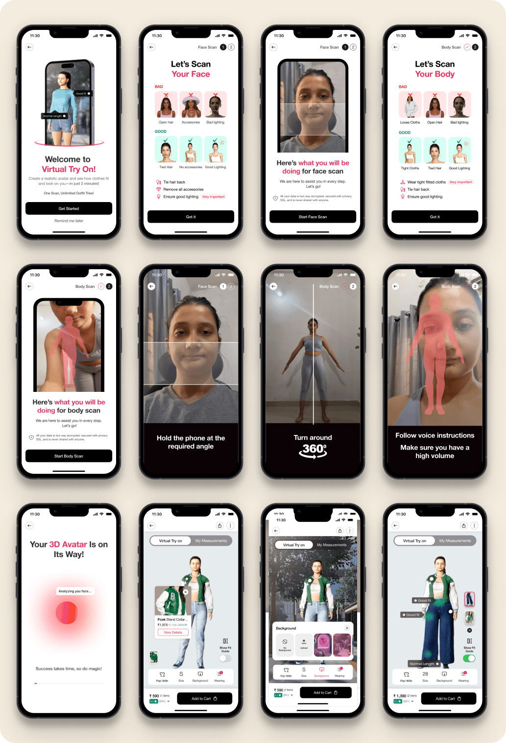
Solution Explanation

Solution Explanation

Meet Neha👋, who's about to experience how virtual try on transforms her shopping journey.

Meet Neha👋, who's about to experience how virtual try on transforms her shopping journey.

Meet Neha

📍 Neha quickly finds her avatar and size recommendation on the product details page right when she needs them.

📍 Neha quickly finds her avatar and size recommendation on the product details page right when she needs them.

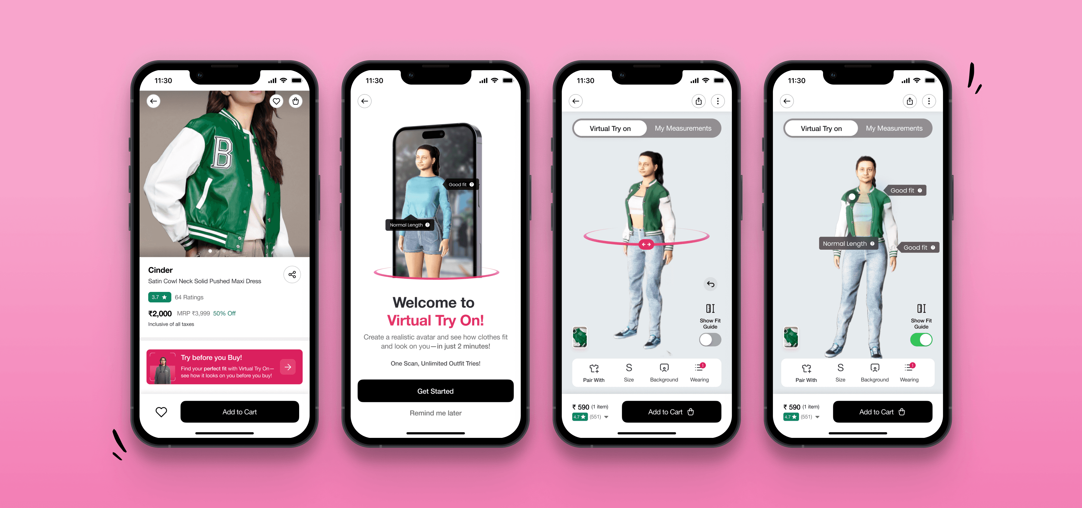
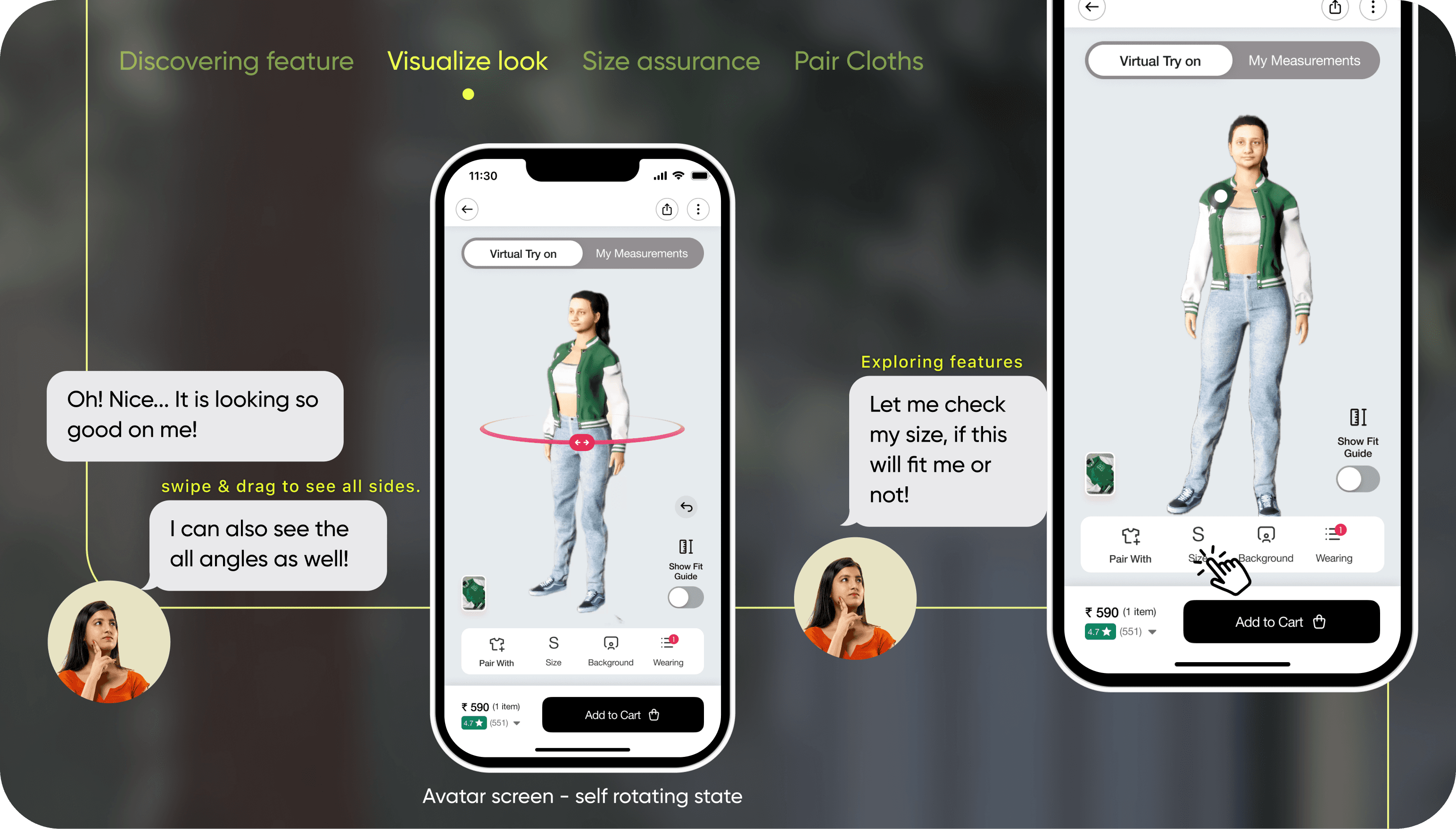
Neha visualising her look

👀 Neha effortlessly viewed her avatar from all sides, giving her the confidence to make the right choice.

👀 Neha effortlessly viewed her avatar from all sides, giving her the confidence to make the right choice.

Neha discovering virtual try on feature

📐 Neha quickly went to her size and started exploring the fit guide for a more detailed view.

📐 Neha quickly went to her size and started exploring the fit guide for a more detailed view.

Neha checking her Fit

👖 Neha paired her jacket with a jeans, making styling decisions easier and more exciting!

👖 Neha paired her jacket with a jeans, making styling decisions easier and more exciting!

Neha Pairing jacket with jeans

Before moving ahead; let’s understand my Rational behind these screens

How do I make this feature easily discoverable?

Through my research, I Realised that users only look for information when they actually need it - everything else just fades into the background.


So, I asked myself: How can I make sure they spot this feature right when they need it? 🤔

The answer? Make it super easy to find!

✅ I placed this feature in product image, as image is the one thing user interacts with after entering to product detail page as per the findings.

For returning users, It instantly recommends the perfect fit based on their scan 

if user want to re-scan, Users can rescan anytime, straight from the product page.

What is this? My rationals on making try on feature discoverable

How did I ensure users could check their size effortlessly?

The major challenge I faced while displaying size information was ensuring that users could find fit and size details based on their specific needs.


Those who are serious about sizing should have the option to view detailed measurements, while those who prefer a quick selection should not feel overwhelmed. Additionally, users more focused on appearance should have the flexibility to skip size details altogether.


The goal was to create a seamless experience that adapts to different user preferences without adding friction. Here’s how I solve this 👇

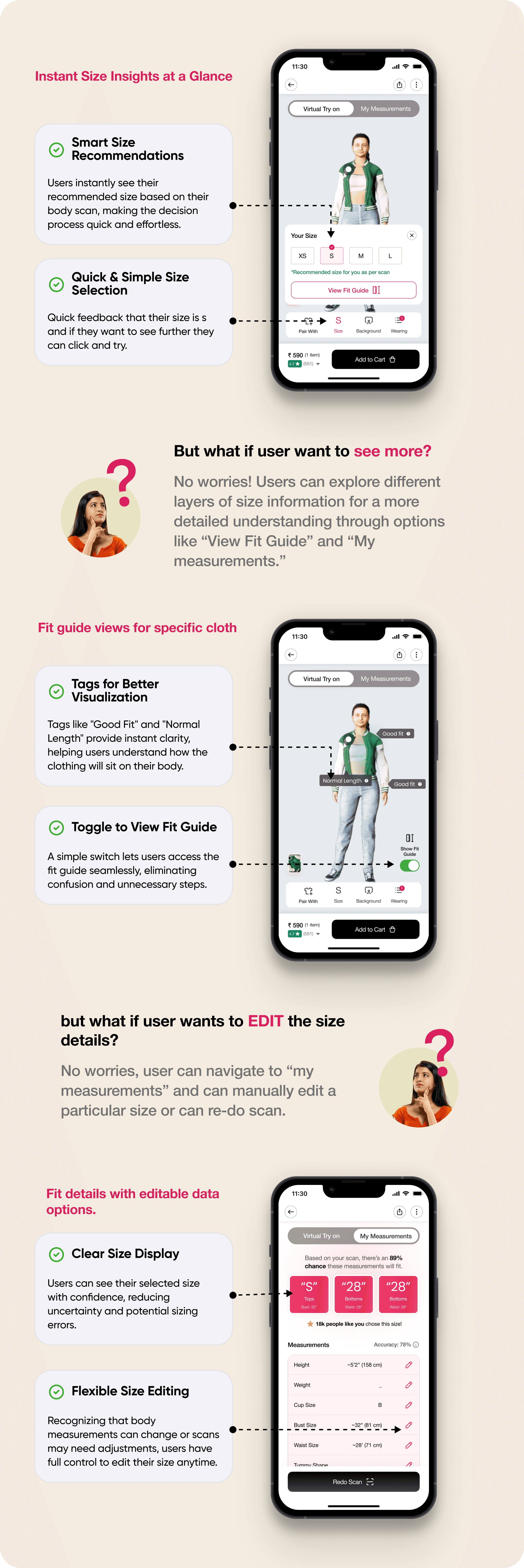
What is this? My rationals on making size checking easy

How Did I Make Styling Effortless for Users?

Through my research, I discovered that users often shop with a pairing in mind 


they're either:

👗 look for something to match with an existing outfit.

🛍️ or prefer to buy a complete set in one go

This insight led me to introduce a pairing feature which can give better clarity for users to visualize how an item pair with the cloths they already have and their is the high possibility that user will buy it in pair result in increase in Average order value (AOV).


For businesses, this isn't just a convenience feature - it's a growth opportunity. By making styling effortless, the experience becomes more engaging, increasing conversions, session time, and overall sales. A true win-win! 🚀

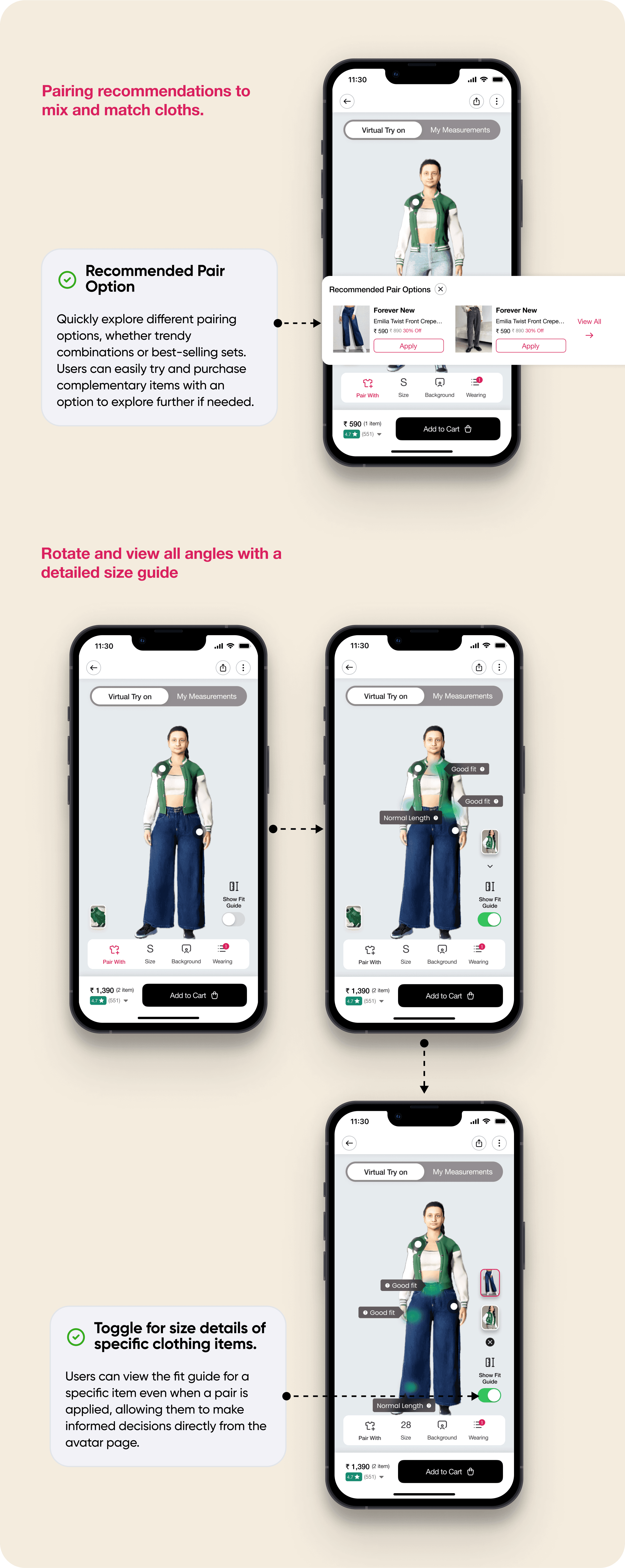
What is this? My rationals on making pairing easy

Notable Decisions

Notable Decisions

Four Game-Changing Decisions That Redefined the North Star 🌟!

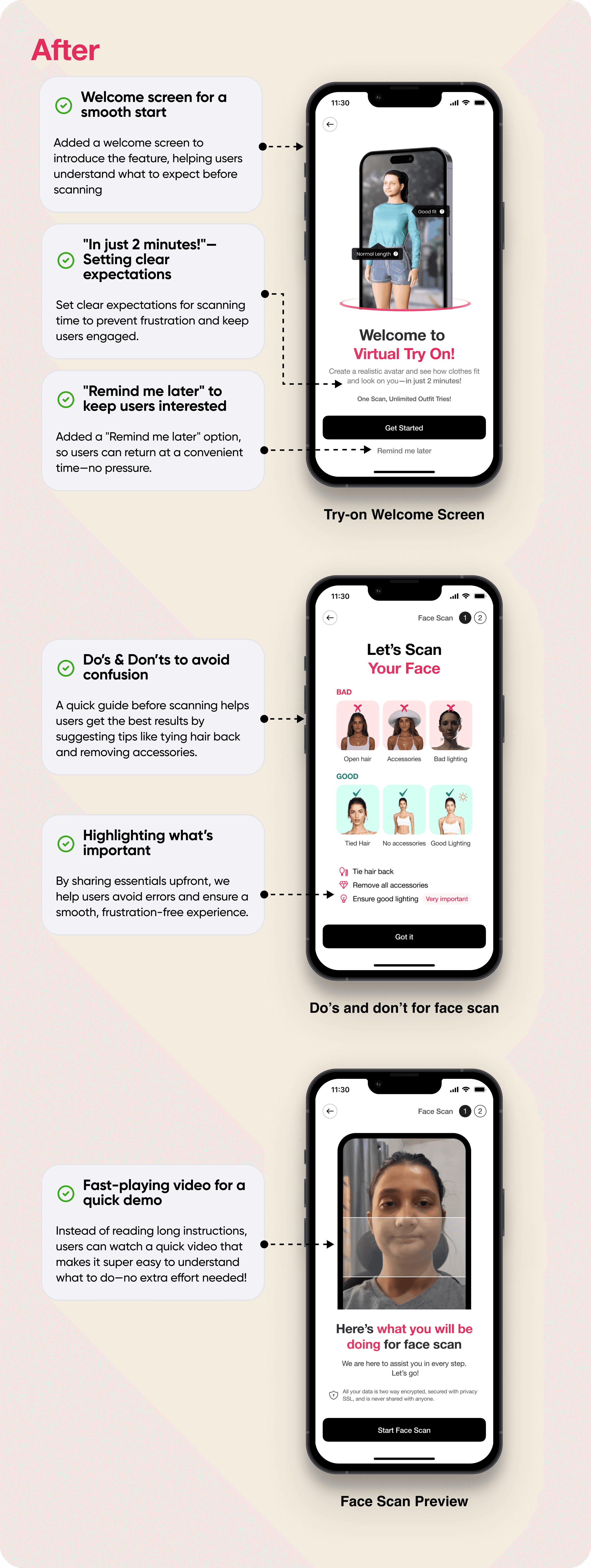
#1. Here’s why — I decided to change the guideline screen before scan

What I thought will happen:


Intended to reduce confusion: By informing users about the pre-scan steps will reduce confusion while scanning.

✔ prevent Users from encountering error cases.

What I thought will happen:


Intended to reduce confusion: By informing users about the pre-scan steps will reduce confusion while scanning.

✔ prevent Users from encountering error cases.

What Actually Happened:


❗️ Become more confusing: user testing revealed that the screen was confusing to understand.

❗️ Users were getting distracted by images, and the information was NOT being conveyed effectively.

❗️ 9+ screens overwhelmed them.

What Actually Happened:


❗️ Become more confusing: user testing revealed that the screen was confusing to understand.

❗️ Users were getting distracted by images, and the information was NOT being conveyed effectively.

❗️ 9+ screens overwhelmed them.

What is this? Issue identified after user testing.

I Cut down effort and friction needed in screen to fix this:


Added a welcome screen to introduce this new feature instead of directly moving to the scan, helping users understand its purpose and what to expect.


Replaced the instruction screen with a fast-playing video to quickly show users the steps without effort, making it more engaging and attention-grabbing.


Introduced a "✅ Do's and 🚫 Don'ts" screen before the scan to prepare users by clearly showing what to avoid and what's important, preventing future confusion and disappointments while encountering error cases.

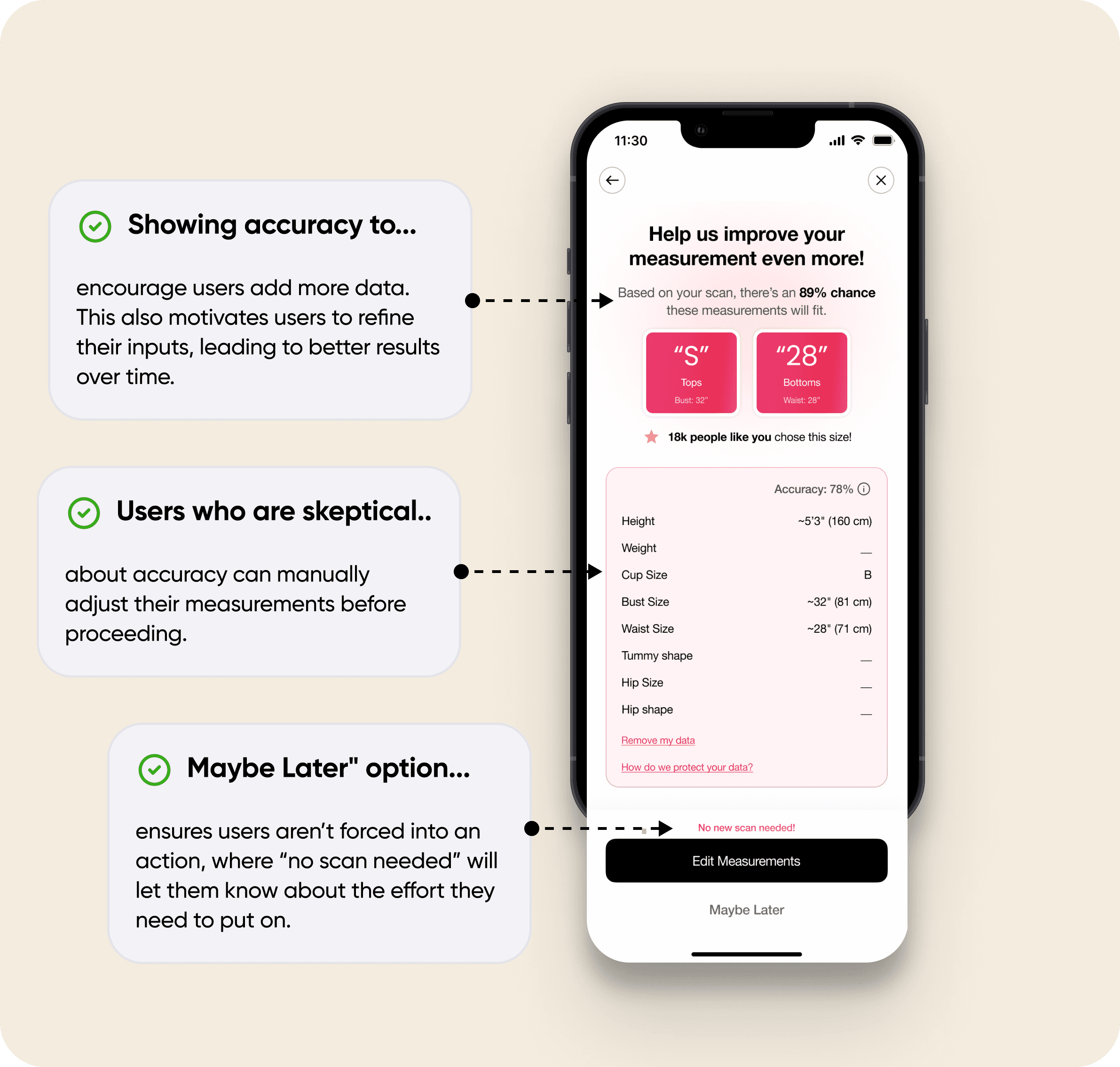
#2. How Allowing Measurement Edits Before Final Results Can Strengthens User Trust

Since this was a new feature, users were unsure whether the system would provide precise results. Additionally, privacy concerns made them hesitant to proceed with the try-on experience.

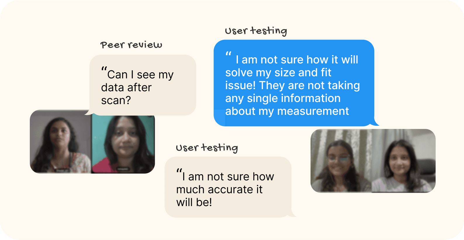
What is this? → Real user insights exposing concerns regarding privacy

To address these issues, I introduced a measurement review and editing screen before displaying the final results.


This decision was driven by two key insights:


  • By allowing users to preview their estimated measurements before confirmation, they gain a sense of control, reducing hesitation and increasing trust in the system.


  • Users can review and modify their measurements before finalising, ensuring the recommendations align with their expectations.

#3. Here’s why I changed the layout for size

Research showed that users rely on reviews and ratings for purchase decisions, seeking social proof even when other features are available.

Problem with existing design:


❗️Users have no option to try different sizes. If the recommended size is S, they can't see how M would fit. This restriction makes it harder to compare and choose the best fit.


❗️There were multiple ways to check fit—"How Fit" and "Your Size"—but they felt disconnected. Unclear mapping made the experience disjointed. Size-related features should be seamlessly connected for better usability.

Here’s what I did:


I used a familiar pattern that already on the product detail page. When they click "View Fit Guide," they can access the fit guidance.


✅ And if they want more detailed measurement information, they can switch to the "My Measurements" section. This approach makes the process simple, intuitive, and easy to understand.

Here's what I did:


Since adding ratings at the top felt redundant, removing them made the section feel less like a review.

Through interviews and research, I found that users find image and video reviews very helpful. So, I decided to display a small card if a review includes an image, helping users get a clearer idea of the type of clothing they are purchasing.

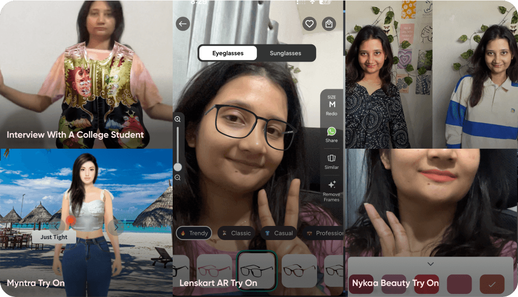
#4. Why Static Try-Ons Over 3D Immersive Experience?

I first considered AR try-on since it’s a trendy and proven solution, but my goal wasn’t just to add AR. it was to genuinely solve fit and appearance issues. Instead of rushing into a solution, I took a step back to deeply understand user pain points from a broader perspective.


see what i realized in the way of finding solution.

Okay! now that you have gone through solution decision i made. Time to show How I actually come to the final screens and design system.

Okay! now that you have gone through solution decision i made. Time to show How I actually come to the final screens and design system.

Process

Process

After secondary research I found that..


94% of people are relying on the reviews for size and fit…

I started my research by studying about what makes user take purchase decisions, where i stumbled upon this eye opening statistics from power reviews

I started my research by studying about what makes user take purchase decisions, where i stumbled upon this eye opening statistics from power reviews

Over 53% of clothing shoppers say they specifically look for a favorable returns and exchange policy when determining whether or not to buy a product. Nearly all (92%) of consumers pay attention to sizing and fit information when shopping for clothing.

Over 53% of clothing shoppers say they specifically look for a favorable returns and exchange policy when determining whether or not to buy a product. Nearly all (92%) of consumers pay attention to sizing and fit information when shopping for clothing.

the vast majority (94%) of consumers find it helpful to see measurement information for the individual who submitted a review, photo or video of a clothing item. This information makes it easier for shoppers to find content submitted by those with similar body types - and find how a specific item fits them.

the vast majority (94%) of consumers find it helpful to see measurement information for the individual who submitted a review, photo or video of a clothing item. This information makes it easier for shoppers to find content submitted by those with similar body types - and find how a specific item fits them.

After understanding user needs, I decided to analyze existing solutions to identify what works, where the gaps are, and what opportunities exist. Where I found that…

After understanding user needs, I decided to analyze existing solutions to identify what works, where the gaps are, and what opportunities exist. Where I found that…

Most of these apps lacked feature discoverability… and required more effort.

Myntra stood out for offering multiple size guides but lacked discoverability. Other platforms provided minimal guidance, leaving users to interpret size charts on their own.

Myntra stood out for offering multiple size guides but lacked discoverability. Other platforms provided minimal guidance, leaving users to interpret size charts on their own.

Trust, ease of use, and the balance between effort and reward play a crucial role in determining whether users will engage with sizing tools or not.

Trust, ease of use, and the balance between effort and reward play a crucial role in determining whether users will engage with sizing tools or not.

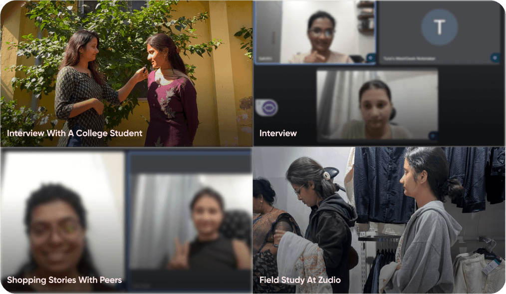
user research gathering

My goal was to understand how users make online clothing purchases and what challenges they face with fit and sizing.


Through interviews, I wanted to uncover what influences their decisions, what information they rely on, and what frustrates them the most.


By asking open-ended questions, I aimed to identify pain points and explore potential solutions that could improve their shopping experience.

Research Insights:

Struggle with Visualization & Decision-Making

Struggle with Visualization & Decision-Making

Lack of Discoverability

Important details like model height aren’t easily visible, making it hard for users to imagine how the clothing will look on them.

Thinking Beyond Single Items

While shopping, users also consider what else an item can be paired with to make better purchase decisions.

Uncertainty in Reviews & Model Images

Reviews and product images don’t always match reality, making users feel like they are taking a gamble when buying.

Gaps in Personalization & Shopping Experience

Gaps in Personalization & Shopping Experience

Measuring & Effort Barrier

Users don’t want to put extra effort into measuring themselves, and there’s no proper guidance or encouragement, leading to dissatisfaction with sizing.

Lack of Offline-Like Assurance

Users prefer online shopping for convenience but miss the confidence of trying on clothes in-store before buying. There’s a need to bring the offline shopping experience closer to an online one.

Ideation: It all started with a setback…

I initially explored AR try-on since existing solutions weren’t solving the problem effectively. I spent four days researching platforms like Snapchat AR and 3D modeling technologies.


Through testing, I realized AR try-on had major usability challenges, especially on personal devices. It worked better on larger screens, but users struggled with clothing quality, patterns, and model distortions when viewing up close.


These insights led me to rethink the approach and explore more reliable, user-friendly solutions.

From Messy Beginnings to Refined Solutions : challenge

With limited references and patterns for this category, creating a user-friendly flow was challenging. Being new to this domain, it was also difficult to figure out the right copy and language for communication.


Here are a few things I did that played a huge role in iterating the design to its final version:


Explored different apps with related features:


  1. Checked Lenskart to see how they display similar features, where they place them, and the possible reasons behind their choices.


  1. Analyzed their scanning flow to understand the overall process of taking a scan and what made sense for users.


Researched measurement apps:


Looked into apps like 3D Measure, in3D, MeasureMe and Spren to understand their flow, how they collect data, and how the process works.


Checked Myntra's new Try-On feature:


Observed how it works and evaluated its usefulness for users.

I sketched multiple user flows to visualize ideas quickly. My focus at this stage is to diverge first, converge later. Here are some early sketches of the Brand page.

What is this? First sketch flow after the paper research

Usability Testing

Usability Testing

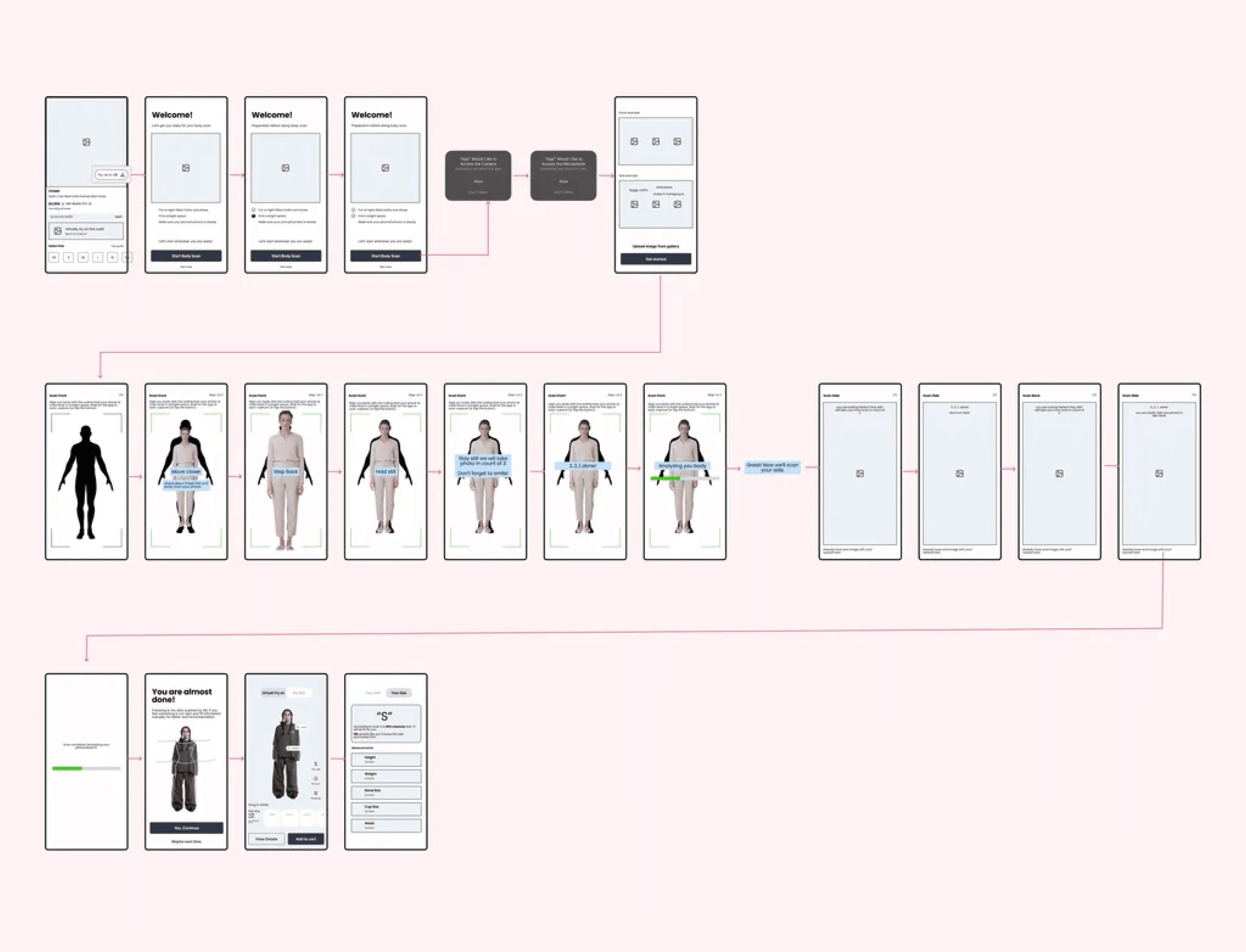
I went through 15+ iterations for various reasons

...including a confusing scanning flow, UI improvements, and enhancing the overall user experience. Here are some of the iteration happened after user testing

...including a confusing scanning flow, UI improvements, and enhancing the overall user experience. Here are some of the iteration happened after user testing

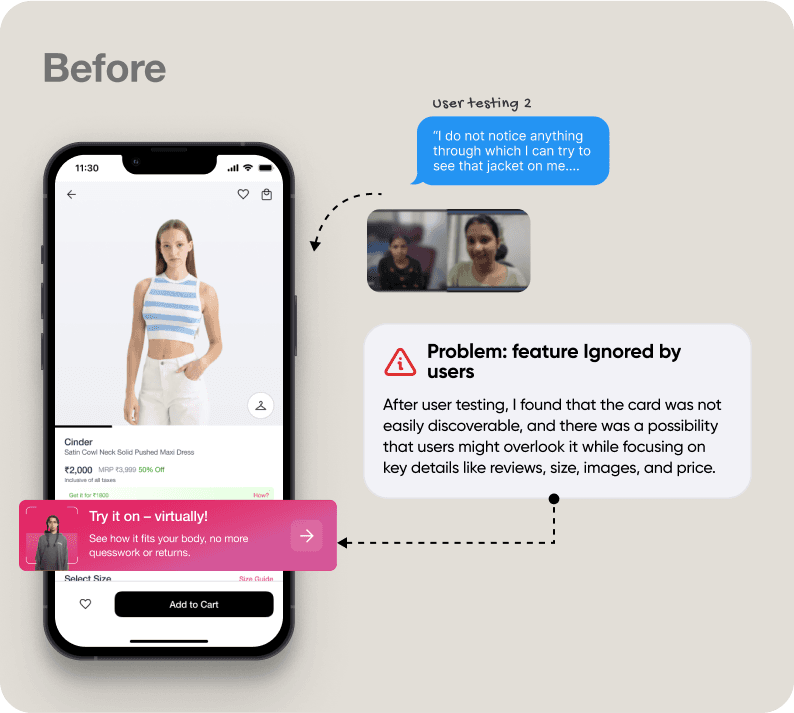
#1. Updated the card copy to improve recoverability.

After user testing, I found that the card was not easily discoverable, and there was a possibility that users might overlook it while focusing on key details like reviews, size, images, and price.

After user testing, I found that the card was not easily discoverable, and there was a possibility that users might overlook it while focusing on key details like reviews, size, images, and price.

Which made me realise that if Try on tool exists, it must be very discoverable for users to notice it; it should also clearly communicate what it is and why users should interact with it.

Which made me realise that if Try on tool exists, it must be very discoverable for users to notice it; it should also clearly communicate what it is and why users should interact with it.

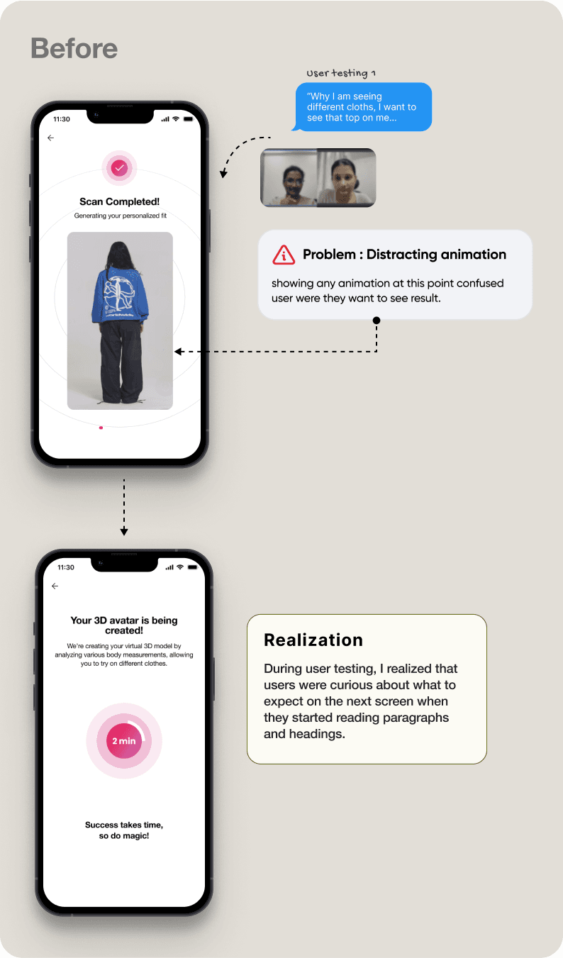
#2. Iteration on loading screen

After user testing I realised animation can be risky here, Initially I added this feature as a loading screen which help them see different cloths in their body while waiting for final result. But showing any visual at this point can confuse user were they want to see result.

After user testing I realised animation can be risky here, Initially I added this feature as a loading screen which help them see different cloths in their body while waiting for final result. But showing any visual at this point can confuse user were they want to see result.

Problem with existing design:


Showing any animation at this point can confuse user were they want to see result.

During user testing, I realized that users were curious about what to expect on the next screen when they started reading paragraphs and headings.

Problem with existing design:


Showing any animation at this point can confuse user were they want to see result.

During user testing, I realized that users were curious about what to expect on the next screen when they started reading paragraphs and headings.

Here’s what I did:


By adding a percentage instead of time, users could still track progress without feeling like it was taking too long.

Providing information about what’s happening in the backend created a sense of personalisation and kept users informed.

Here’s what I did:


By adding a percentage instead of time, users could still track progress without feeling like it was taking too long.

Providing information about what’s happening in the backend created a sense of personalisation and kept users informed.

#3. Updated Icon and Copy for Better Clarity

👉 Problem with “Backdrop”: Unfamiliar Term:


User testing revealed that "backdrop" is not widely recognized or understood. I initially assumed that pairing it with an icon would clarify its meaning, but it ended up causing confusion instead.


Here’s what I did:


I Used similar and widely used term like changing “backdrop” to Background it was very clear for users without even clicking it.


👉 Problem with “Style”: Lack of Clarity


I initially assumed that "Style" would be easily understood since it's commonly used. However, in the context of clothing, users were unsure whether it referred to styling the model with makeup and accessories or just the clothing itself.


Here’s what I did:


I Used Relevant icon with simpler text. Similar and widely used term like changing “backdrop” to Background it was very clear for users without even clicking it.

Final Design

Final Design

Check the final Screens

Future Scope

Future Scope

If there was a sequel, what could we expect?

If there was a sequel, what could we expect?

What would I have done differently?


I would have invested more time in using a better prototyping tool, which could have provided deeper insights during usability testing. However, Figma’s prototyping limitations restricted the experience, and switching to a different tool like Protopie would have required additional time for learning, making it an impractical choice at that stage.

What would you do next? Why?


Refining the scanning flow to reduce friction:

During user testing, one candidate mentioned that if the tool required them to change clothes for scanning, they would abandon the process. Given more 🕰️ time, I would have researched this further, validated the concern, and explored opportunities to make the experience more seamless and frictionless.


Expanding to Styling and Body Shape

The current solution primarily focuses on two key aspects: fit and look. However, it does not assist users in styling according to their body shape. During my research, I identified this gap—many users struggle with styling choices that complement their body type. Given more time, I would explore ways to incorporate personalised styling guidance into the experience.


Addressing Uncertainty in Scanning

During peer reviews and user interviews, I realised a critical gap in the design—users were unsure about what they needed to remove before scanning.


One user asked, "Should I wear shoes while scanning?" while another questioned, "Do I really have to remove all my jewellery, even small pieces?"

This made me realise their is no clear guidance on what accessories are acceptable during scanning. Initially, I tried solving this by adding multiple guidelines, but it overwhelmed users, so I had to remove them. If I had more time, I would iterate on this by finding a more intuitive way to communicate these instructions without causing cognitive overload.

Learnings

Learnings

What I Learned 🌱

What I Learned 🌱

Fresh Perspectives Matter

Peer reviews made me realize how different backgrounds shape design thinking. Akshay’s technical insights helped me consider development costs, technology constraints, and cost-effective solutions—just like real-world team discussions. My perspective shifted when Srishti asked, *"Did you consider trying on clothes with and without heels?"*—something I hadn’t thought of since I’m not deeply involved in fashion.

Embracing Feedback (Even When It’s Exhausting! 😅

Peer reviews were intense but invaluable. I learned to see feedback as a tool for growth, improving my time management and ability to handle constructive criticism—essential for real-world projects.

Moving Forward Despite Uncertainty

At times, I wasn’t clear on every possibility in my design. But instead of getting stuck, I focused on what I understood, iterated, and ensured timely delivery—putting ideas on the table rather than waiting for perfection.

User Interviews with Strangers and field study Are Eye-Opening

Interviewing unknown users was a game-changer. Their unbiased responses provided fresh insights, and it’s something I’ll prioritize in future projects.


People don’t always express what they truly feel or do. Watching users interact with the product in their own space revealed pain points they might not have verbalized.

Leveraging AI for Efficiency

AI tools like chatbots for meeting notes and avatar builders for prototyping made my workflow faster and smoother, showing how technology can improve the design process.

Thank you for reading 🤍 to the end! If this case study resonates with you or you’d like to share your feedback, please feel free to reach out to me on LinkedIn